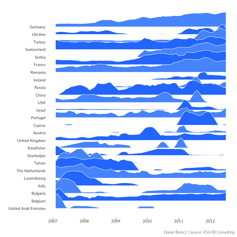
Test joyplot on the flights data set
This week I’ve seen an interting visualization tweeted:
and I thought I’d try to reproduce it on a different dataset for practice.
You can find the original repo here.
Setup
First I load the packages with the pacman package. This will install the packages if they aren’t on the system. Next I create a variable for the project root called root, this will help with correctly referencing the project files. After this I set the knitr parameters as I like it.
if (!require("pacman")) install.packages("pacman")
pacman::p_load(rprojroot,
               tidyverse,
               readxl,
               knitr,
               printr,
               bookdown,
               viridis,
               ggthemes)

root <- find_root(is_rstudio_project)

opts_knit$set(root.dir = root)

knitr::opts_chunk$set(echo = TRUE,
                      cache = TRUE,
                      include = TRUE,
                      message = FALSE,
                      warning = FALSE,
                      error = FALSE,
                      fig.align = 'center',
                      fig.show  = 'asis',
                      fig.width = 8,
                      fig.height = 8,
                      fig.retina = TRUE
                      )
Visualization
In this step I source the theme created by the original vis creator directly from Github, and download the data file from the satRday site.
source("https://cdn.rawgit.com/halhen/viz-pub/e905a29f/sports-time-of-day/henrik.r")

bud_url <- "http://budapest.satrdays.org/data/BUD%20flights%202007-2012%20v2.xlsx"

raw_path <- "/data/raw/"
flights_name <- paste0(root, raw_path, "flights.xlsx")

dir.create(paste0(root, raw_path), recursive = TRUE)

if(!file.exists(flights_name)) {
  download.file(url = bud_url,
                destfile = flights_name,
                method = "libcurl", mode = "wb")
}
Before I can visualize the data, first I had to clean it. I converted the column names to a normal format, created a list of the top 25 countries by shipped cargo weight. After this I removed the not needed columns.
file_list <- dir(paste0(root, raw_path), pattern = ".xlsx", full.names = TRUE)

flights <- read_excel(file_list, sheet = 1)

colnames(flights) <- tolower(gsub(" ", "_", names(flights)))

# Create a list of the top 25 countries by cargo weight
top_countries <- flights %>%
  group_by(country) %>%
  summarise(cargo_sum = sum(cargo_weight)) %>%
  top_n(n = 25, wt = cargo_sum)

country_list <- as.list(top_countries$country)

# filtering the data, and removing the not needed columns
flights <- flights %>%
  extract(date_year_month, regex = "[0-9]{4}([0-9]{2})",
          into = "date_year_month") %>%
  filter(!is.na(city)) %>%
  select(-c(commercial_flag, city, region, date_half_year, date_year_quarter, date)) %>%
  mutate(years = as.numeric(date_year) + as.numeric(date_year_month)/12) %>%
  group_by(country, date_year, date_year_month, years) %>%
  summarise(nbr_pass = sum(cargo_weight)) %>%
  slice(country %in% top_countries$country)
Next I copied the visualization code from the original author’s code, and changed the variables.
viz_cols <- quos("nbr_of_passengers", "cargo_weight")

flights %>%
  group_by(country) %>%
  arrange(years) %>%
  mutate(p_peak = nbr_pass / max(nbr_pass),
         p_smooth = (lag(p_peak) + p_peak + lead(p_peak)) / 3,
         p_smooth = coalesce(p_smooth, p_peak)) %>%
  ungroup() %>%
  mutate(country = reorder(country, p_peak, FUN=which.max)) %>%
  arrange(country) %>%
  mutate(country.f = reorder(as.character(country), desc(country))) %>%
  {
    country <- levels(.$country)

    ggplot(., aes(years, group=country.f,
                  fill=factor(as.integer(country.f) %% 2))) +
      geom_ribbon(aes(ymin = as.integer(country),
                      ymax = as.integer(country) + 2 * p_smooth),
                  color='white', size=0.4) +
      scale_y_continuous(breaks = 1:length(country),
                         labels = function(y) {country[y]}) +

      scale_fill_manual(values = c('0' = '#2A7FFF', '1' = '#5599FF')) +
      labs(x="", y="", caption='Dániel Berecz | Source: KSH/BI Consulting') +
      theme_henrik(grid='', legend.position='none') +
      theme(axis.ticks.x = element_line(size=0.3))
  }
Figure 1: Shipped cargo weigth to the top 25 countries
Conclusion
You can see an interesting shift in destionation countries for the cargo. I started with plotting the passenger number distributions, but there wasn’t any intersting pattern in it at first sight. I plan to plot that also, but I will try to make it with code that uses non-standard evaluation, so I can avoid copying code.