Visualizing the flights data from the satRday Visualizaiton Challenge
The first satRday was held in Budapest the last year. There was a Visualization Challenge and I decided to participate on it. Unfortunatelly, because of technical difficulties, I couldn’t send my work in before the deadline, but I often come back to this data set, for testing out new things like this blog.
Setup
I started to get into R around the satRday, and I learned a lot since then, so I decided I update the a code a bit. First, I split out the data prepration in seperate files, and I made the setup more dynamic.
if (!require("pacman")) install.packages("pacman")
pacman::p_load(rprojroot,
               knitr,
               printr,
               bookdown,
               viridis,
               ggthemes)

root <- find_root(is_rstudio_project)

opts_knit$set(root.dir = root)

knitr::opts_chunk$set(echo = TRUE,
                      cache = TRUE,
                      include = TRUE,
                      message = FALSE,
                      warning = FALSE,
                      error = FALSE,
                      fig.align = 'center',
                      fig.show  = 'asis',
                      # fig.width = 12,
                      # fig.height = 12,
                      fig.retina = TRUE
                      )

# rm(list = ls())
bud_url <- "http://budapest.satrdays.org/data/BUD%20flights%202007-2012%20v2.xlsx"
airports_url <- "https://raw.githubusercontent.com/jpatokal/openflights/master/data/airports.dat"
raw_path <- "/data/raw/"
flights_name <- paste0(root, raw_path, "flights.xlsx")
airports_name <- paste0(root, raw_path, "airports.csv")
dir.create(paste0(root, raw_path), recursive = TRUE)
if(!file.exists(flights_name)) {
download.file(url = bud_url,
destfile = flights_name,
method = "libcurl", mode = "wb")
}
if(!file.exists(airports_name)) {
download.file(url = airports_url,
destfile = airports_name,
method = "libcurl", mode = "wb")
}
# removes the data folder and its contents recursivelly
# unlink(x = "data*", recursive = TRUE)pacman::p_load(readxl,
tidyverse,
lubridate)
file_list <- dir(paste0(root, raw_path), pattern = ".xlsx", full.names = TRUE)
flights <- read_excel(file_list, sheet = 1)
# colnames(flights) <- tolower(gsub(" ", "_", names(flights)))
# flights_cleaned <- flights %>%
# mutate(month = month(date)) %>%
# select(-c(region, commercial_flag, date_half_year, date_year_quarter,
# date_year_month, date, destination)) %>%
# filter(!is.na(city))
#
# char_cols <- names(flights_cleaned[, sapply(flights_cleaned, class) == 'character'])
#
# flights_cleaned[sapply(flights_cleaned, is.character)] <-
# lapply(flights_cleaned[sapply(flights_cleaned, is.character)],
# as.factor)dimension <- dim(flights)
names(dimension) <- (c("rows", "columns"))
knitr::kable(dimension, caption = "Flights dataset dimensions")| rows | 18837 |
| columns | 16 |
knitr::kable(t(head(flights, n = 4)), caption = "First few rows of the data")| DESTINATION | Aalborg | Aalborg | Aalborg | Aarhus |
| COMMERCIAL FLAG | Commercial | Commercial | Commercial | Commercial |
| CITY | Aalborg | Aalborg | Aalborg | Aarhus |
| REGION | NA | NA | NA | NA |
| COUNTRY | Denmark | Denmark | Denmark | Denmark |
| FLIGH DIRECTION | Incoming | Outgoing | Incoming | Incoming |
| FLIGHT TYPE | Non Scheduled | Non Scheduled | Non Scheduled | Non Scheduled |
| DATE | 2010-11-01 | 2010-12-01 | 2011-01-01 | 2007-05-01 |
| DATE YEAR | 2010 | 2010 | 2011 | 2007 |
| DATE HALF YEAR | 2010H2 | 2010H2 | 2011H1 | 2007H1 |
| DATE YEAR QUARTER | 2010Q4 | 2010Q4 | 2011Q1 | 2007Q2 |
| DATE YEAR MONTH | 201011 | 201012 | 201101 | 200705 |
| NBR OF PASSENGERS | 0 | 0 | 0 | 102 |
| CARGO WEIGHT | 0 | 0 | 0 | 0 |
| NBR OF FLIGHTS | 1 | 1 | 1 | 1 |
| SEAT CAPACITY | 0 | 0 | 0 | 200 |
col_meaning <- data.frame(names(flights),
                  c("Flight destination", "Aircraft type", "Destination city",
                    "Country region", "Country", "The direction of the flight",
                    "Flight type", "Flight date", "Flight year",
                    "Flight half year", "Flight quarter", "Flight month",
                    "Number of passengers", "Weight of transported cargo",
                    "Number of flights on this route", "Seat capacity"))

names(col_meaning) <- c("Column name", "Description of the data")

knitr::kable(col_meaning, caption = "Column names, and desctiption")| Column name | Description of the data |
|---|---|
| DESTINATION | Flight destination |
| COMMERCIAL FLAG | Aircraft type |
| CITY | Destination city |
| REGION | Country region |
| COUNTRY | Country |
| FLIGH DIRECTION | The direction of the flight |
| FLIGHT TYPE | Flight type |
| DATE | Flight date |
| DATE YEAR | Flight year |
| DATE HALF YEAR | Flight half year |
| DATE YEAR QUARTER | Flight quarter |
| DATE YEAR MONTH | Flight month |
| NBR OF PASSENGERS | Number of passengers |
| CARGO WEIGHT | Weight of transported cargo |
| NBR OF FLIGHTS | Number of flights on this route |
| SEAT CAPACITY | Seat capacity |
na_values <- map(.x = flights, .f = is.na) %>%
  map(.f = sum) %>%
  as.data.frame() %>%
  t()

knitr::kable(na_values, caption = "Number of missing values in the columns")| DESTINATION | 2 |
| COMMERCIAL.FLAG | 0 |
| CITY | 2 |
| REGION | 14520 |
| COUNTRY | 0 |
| FLIGH.DIRECTION | 0 |
| FLIGHT.TYPE | 0 |
| DATE | 0 |
| DATE.YEAR | 0 |
| DATE.HALF.YEAR | 0 |
| DATE.YEAR.QUARTER | 0 |
| DATE.YEAR.MONTH | 0 |
| NBR.OF.PASSENGERS | 0 |
| CARGO.WEIGHT | 0 |
| NBR.OF.FLIGHTS | 0 |
| SEAT.CAPACITY | 0 |
colnames(flights) <- tolower(gsub(" ", "_", names(flights)))

flights_filtered <- flights %>%
  select(-c(commercial_flag)) %>%
  extract(date_half_year, regex = "([A-Z][0-9])",
          into = "date_half_year") %>%
  extract(date_year_quarter, regex = "([A-Z][0-9])",
          into = "date_year_quarter") %>%
  extract(date_year_month, regex = "[0-9]{4}([0-9]{2})",
          into = "date_year_month") %>%
  filter(!is.na(city)) %>%
  select(-c(city))
eda_plot <- ggplot(flights, aes(nbr_of_passengers, seat_capacity)) +
geom_point() +
xlab("Nr. of passengers/route/month") +
ylab("Seat capacity/route/month")
eda_plot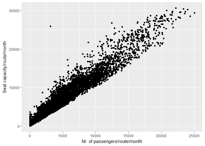
First look at the data
# dir.create(paste0(root, "img"), recursive = TRUE)
#
# ggsave(filename = paste0(root, "img/eda_plot.png"), device = "png",
#        plot = eda_plot, limitsize = TRUE, dpi = 72)
#
# knitr::include_graphics(paste0(root, "img/eda_plot.png"))
# flights <- read_csv("data/interim/flights_v2.csv")
flights <- flights %>%
mutate(lg_pass = log2(nbr_of_passengers),
lg_seat = log2(seat_capacity))
flights[!is.finite(flights$lg_pass), "lg_pass"] <- 0
flights[!is.finite(flights$lg_seat), "lg_seat"] <- 0
mod <- lm(lg_seat ~ lg_pass, data = flights)
flights <- flights %>% mutate(rel_seat = resid(mod))
binned_plot <- ggplot(flights, aes(lg_pass, lg_seat - lg_pass)) +
geom_bin2d() +
xlab("Log2 of Nr. of Passengers/route/month") +
ylab("Log2 of Seat Capacity/route/month")
binned_plot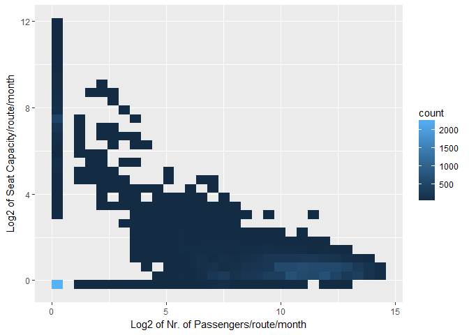
Log converted data
# ggsave(filename = "img/binned_plot.png", device = "png",
#        plot = binned_plot, limitsize = TRUE, dpi = 72)
#
# knitr::include_graphics("img/binned_plot.png")
# plot with background
# from:
# https://drsimonj.svbtle.com/plotting-background-data-for-groups-with-ggplot2
flights_all <- flights %>% select(-date_year)
yearly_dist <- ggplot(flights, aes(lg_pass, lg_seat - lg_pass)) +
geom_point(data = flights_all, color = "grey", alpha = 0.2) +
geom_point(aes(color = factor(date_year))) +
facet_wrap(~date_year, ncol = 3) +
scale_color_viridis(discrete = TRUE, "Year") + theme_bw() +
xlab("Log2 of Nr. of Passengers per route per month") +
ylab("Log2 of Seat Capacity per route per month")
yearly_dist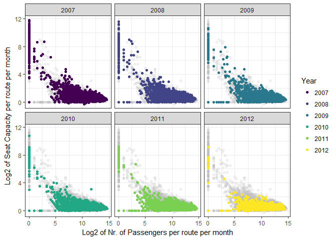
# ggsave(filename = "img/yearly_dist.png", device = "png",
#        plot = yearly_dist, limitsize = TRUE, dpi = 100)
#
# knitr::include_graphics("img/yearly_dist.png")
# from: https://mvuorre.github.io/r/github-waffle-plot/
geom_waffle <- function(data, date_par, data_scale,
scale_name, pal = "D", dir = -1){
waffle_plot <- ggplot(data, aes(x = month(date_par), y = year(date_par),
fill = data_scale)) +
scale_fill_viridis(name = scale_name,
option = pal, # Variable color palette
direction = dir, # Variable color direction
na.value = "grey93",
limits = c(0, max(data_scale))) +
geom_tile(color = "white", size = 0.4) +
scale_x_continuous(
expand = c(0, 0),
breaks = seq(length = 12),
labels = c("Jan", "Feb", "Mar", "Apr", "May", "Jun",
"Jul", "Aug", "Sep", "Oct", "Nov", "Dec")) +
scale_y_continuous(
expand = c(0, 0),
breaks = seq(min(year(date_par)),
max(year(date_par)), by = 1)
) +
theme_tufte(base_family = "Helvetica") +
theme(axis.title = element_text(),
axis.ticks = element_blank(),
legend.position = "bottom",
legend.key.width = unit(1, "cm"),
strip.text = element_text(hjust = 0.01, face = "bold", size = 12)) +
xlab("month") +
ylab("year")
return(waffle_plot)
}# flights <- read_csv("data/interim/flights_v2.csv")
waffle1 <- geom_waffle(flights, flights$date,
flights$nbr_of_passengers,
scale_name = "Nr. of Passengers/route/month")
waffle1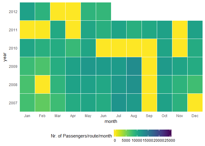
Heatmap of passengers around the years
# ggsave(filename = "img/waffle1.png", device = "png",
#        plot = waffle1, limitsize = TRUE, dpi = 72)
#
# knitr::include_graphics("img/waffle1.png")
waffle2 <- geom_waffle(flights, flights$date,
flights$seat_capacity,
scale_name = "Seat Capacity per route per month")
waffle2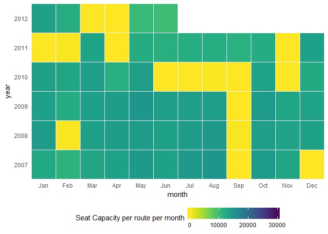
Heatmap of the seat capacity around the years
# ggsave(filename = "img/waffle2.png", device = "png",
#        plot = waffle2, limitsize = TRUE, dpi = 72)
#
# knitr::include_graphics("img/waffle2.png")
waffle3 <- geom_waffle(flights, flights$date,
flights$nbr_of_flights,
scale_name = "Nr. of Flights per route per month")
waffle3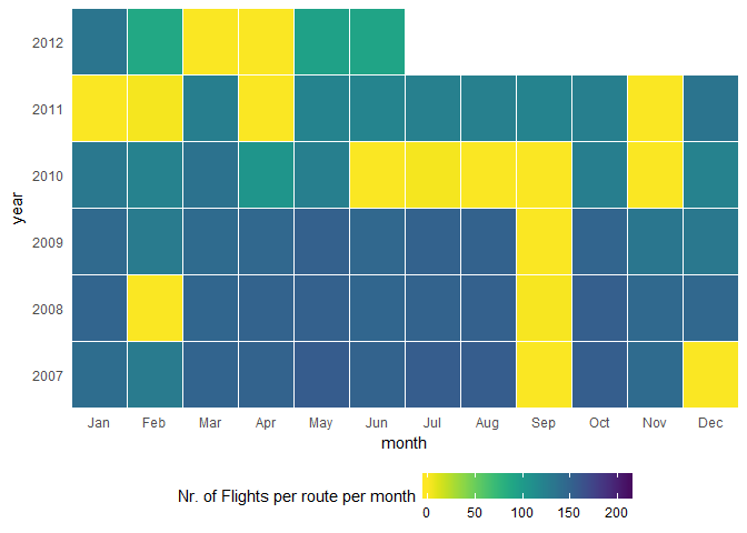
Heatmap of flights around the years
# ggsave(filename = "img/waffle3.png", device = "png",
#        plot = waffle3, limitsize = TRUE, dpi = 72)
#
# knitr::include_graphics("img/waffle3.png")
I also made a heatmap which shows which month had the most passengers for the top 25 countries (Figure ??):
grp_flights <- flights %>%
  mutate(years = as.numeric(date_year) + as.numeric(date_year_month)/12) %>%
  group_by(country, date_year, date_year_month, years) %>%
  summarise(nbr_pass = max(log2(sum(nbr_of_passengers)), 0))

top_countries <- flights %>%
  group_by(country) %>%
  summarise(nbr_pass_country = sum(nbr_of_passengers)) %>%
  top_n(n = 25, wt = nbr_pass_country)

country_list <- as.list(top_countries$country)

grp_flights_filtered <- grp_flights %>%
  slice(country %in% top_countries$country)

min_pass <- min(grp_flights_filtered$nbr_pass)
max_pass <- max(grp_flights_filtered$nbr_pass)
bins <- 5
breaks <- seq(round(min_pass,2), round(max_pass,2) ,
              by = round((max_pass-min_pass)/bins, 2))

heatmap <- ggplot(grp_flights_filtered, aes(y=country, x=years, fill=nbr_pass)) +
  geom_tile(color="white",
            width=.9, height=.9) + theme_minimal() +
  scale_fill_gradientn(colors = viridis::viridis(bins),
                       limits=c(min_pass, max_pass),
                       breaks = breaks,
                       na.value=rgb(246, 246, 246, max=255),
                       labels = breaks,
                       guide=guide_colourbar(ticks=T, nbin=bins,
                                             barheight=.5, label=T,
                                             barwidth=1+sqrt(bins*10))) +
  scale_x_continuous(expand=c(0,0),
                     breaks=seq(2007, 2012, by=1)) +
  labs(x="", y="", fill="") +
  ggtitle("Nr. of montly passengers") +
  theme(legend.position=c(.5, -.10),
        legend.direction="horizontal",
        legend.text=element_text(colour="grey20", size = 6),
        plot.margin=grid::unit(c(.5,1.5,1.5,.1), "cm"),
        axis.text.y=element_text(size=6,
                                 hjust=1),
        axis.text.x=element_text(size=8),
        axis.ticks.y=element_blank(),
        panel.grid=element_blank(),
        title=element_text(hjust=-.07, face="bold", vjust=1))

heatmap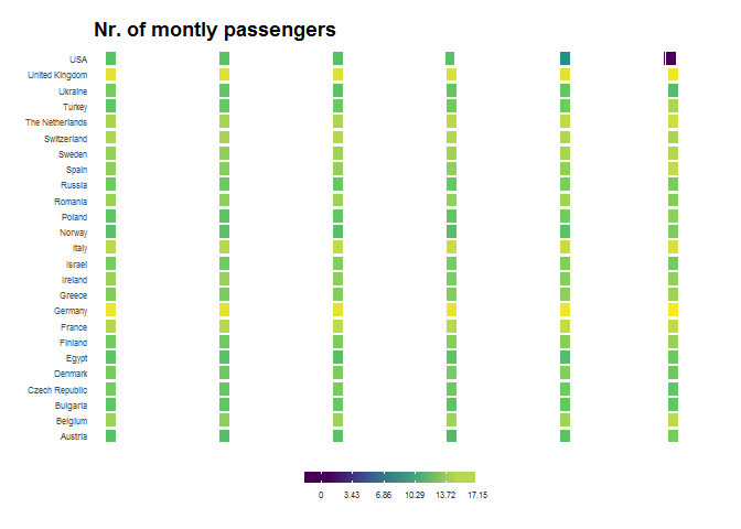
Heatmap of the passenger numbers for the top 25 countries
# ggsave(filename = "img/heatmap.png", device = "png",
#        plot = heatmap, limitsize = TRUE, dpi = 120)
#
# knitr::include_graphics("img/heatmap.png")library(GGally)
cor_mat <- cor(data.matrix(flights_filtered))
ggcorr(cor_mat)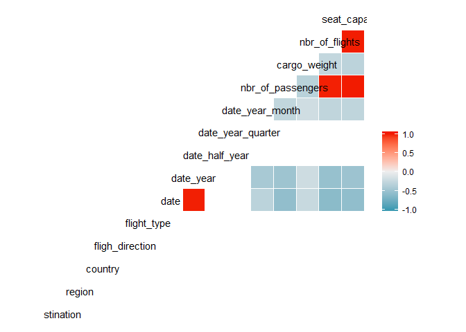
Correlations between variables